



2024 to 2025Brand Design, Web Design & Development, 0 to 1 Design System
JAFFX
Brand, letterforms, and a design system for a guitar pedal you can reprogram from your browser.
The Open-Source Guitar Pedal
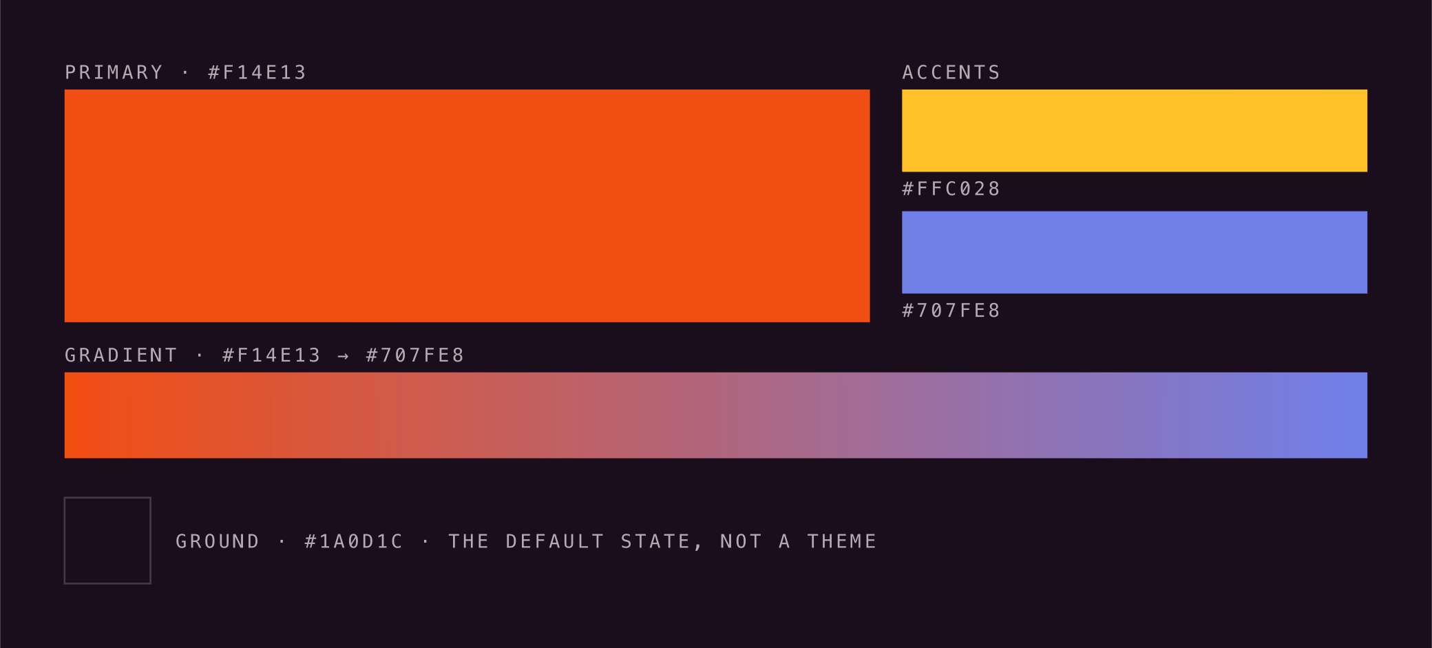
Colour
Primary · #F14E13
Accents
#FFC028
#707FE8
Gradient · #F14E13 to #707FE8
Type
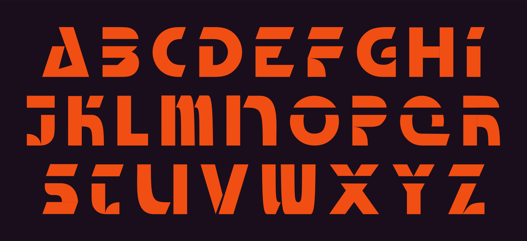
Twenty-six letterforms drawn in house. Everything you read is mono.
The mark
And at avatar size
JAFFX makes a guitar pedal you reprogram from a browser, with an open-source library where players share the effects they build. As the company's first designer, I created its brand, letterforms and design system, and coded its website. The identity had to reach a beginner and a person who writes audio code at the same time.
- Role
- Founding designer and frontend engineer
- Context
- JAFFX, an open-source guitar pedal startup
- Team
- CEO, CTO, two CMOs and me
- Scope
- Eleven months: brand, letterforms, design system, product UI, pitch deck, print, and the site
- Outcome
- Second of 44 teams and $7,500, UCSB New Venture Competition
- Links
- Visit jaffx.audio
01 Starting point
I joined as JAFFX's first designer, before it had a brand
I joined in October 2024. The company had a name, a values document, a Daisy Seed audio dev board and a plan.
The name came from the founder, Joel A. Jaffe, plus FX. Everything else about how JAFFX looked and read was mine to define, with no house style to inherit.
The founders trusted my judgment and never pushed back on my decisions in eleven months. That let me move fast, and it meant I owned every consequence, with no one to catch a mistake.
02 Research
Beginners and tinkerers wanted opposite things from one pedal
The team's market validation, 30 customer interviews and a survey of the category at NAMM, the music industry's trade show, found two segments.
Pedal Curious
Little or no experience with effects. Analog pedals mean buying five units to get a usable range of tones, and digital multi-effects units bury settings in menus.
Tinkerers
Care about customizing their sound as much as playing it. Existing products can't be extended, and they don't connect to each other.
Menu-diving with digital pedals can be overwhelming. There are too many options. Simpler is better.
Beginners find dense menus overwhelming, so I ruled out density as a visual style for the brand.
The founders designed one pedal for both groups: it plays like an analog pedal and reprograms from a browser. My job was to make the brand reach both groups too, at a glance, on a poster.

Boutique analog
Hand-painted enclosures, illustration and nostalgia. Appeals to the Pedal Curious, and reads as a novelty object to a Tinkerer.
Digital multi-FX
Black plastic, gray LCD screens and dense menus. Looks powerful, and looks like the menu-diving that overwhelms beginners.
Open-source tools
Monospace type, terminal screens, flat and utilitarian. Credible to Tinkerers, and cold to a beginner.
Each of these styles reached one segment at most, so copying any of them would have sold JAFFX to half its market. I positioned the brand in the gap between them and defined it with three attributes: sleek, fun and warm.
03 Brand attributes
I built the brand on three attributes: sleek, fun, warm
I tied each attribute to specific shapes, colors and type, so I could apply it the same way on any surface.
Sleek
Simple geometric shapes, gradients, a #1A0D1C dark ground, and monospace for all reading text. This earns credibility with people who write code.
Fun
Varied shapes, bold color and texture, so the brand feels as inviting to explore as a toy. This lowers the barrier for beginners.
Warm
One color carries it: #F14E13, the primary orange, which makes an open-source code project feel welcoming.

The decision I would defend hardest is monospace for all reading text. Monospace is the typography of code and open source, so it tells a Tinkerer the product is open to them, and it stays calm and readable for a beginner. I kept the expressive parts, the display letterforms and the gradient, apart from the text people read.
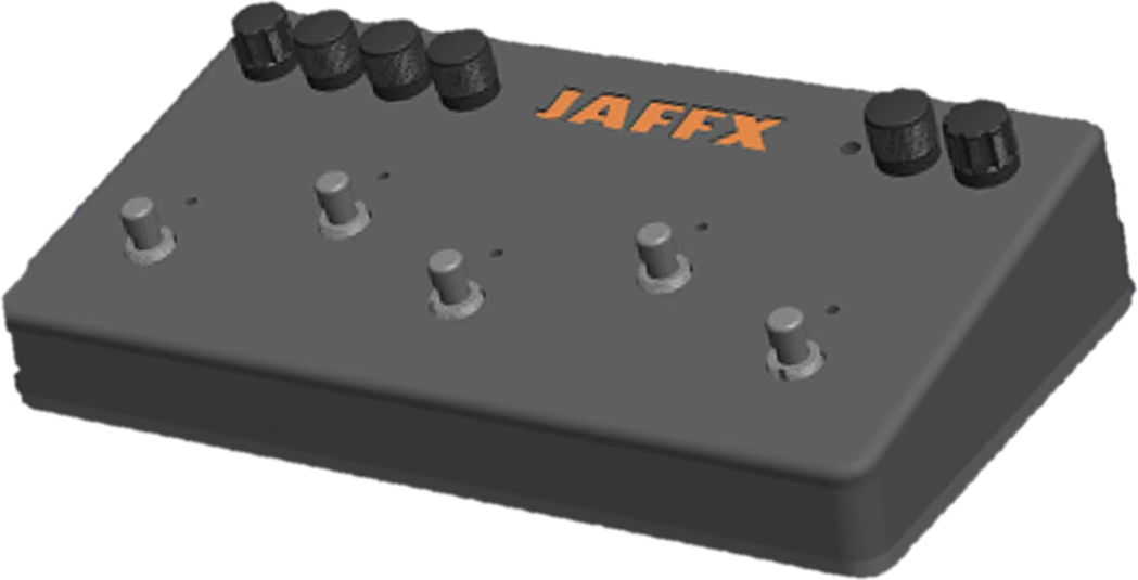
On the website, I drew each navigation item as a pedal knob and marked the active page with a status LED, so the site gets its fun from the interaction and keeps a sleek layout.
04 Typography
I drew our letterforms because we couldn't afford a license
A display face licensed for hardware, merch, print, slides and web costs more than a pre-seed company has.
A free font with unclear terms was a risk I didn't want to hand the founders, so I drew our own, which JAFFX owns outright. I rejected three directions first.
- A rounded, bulbous rock wordmark. It read as a band's logo: nostalgic for the Pedal Curious, and meaningless to a Tinkerer.
- A treble clef and staff notation. Notation suggests you need to read music first, the intimidation the product exists to remove.
- JFX, a shorter mark. Cleaner, but it dropped the founder's name, which the company is named after.
I built the final letters from two rules at once: solid geometric slabs for sleek, each broken by a diagonal or curved cut for fun.
The wide, uppercase, stencil-like forms borrow from amp faceplates and road case stencils. I drew them as vectors in Figma, in the same file as the rest of the system, so the brand stayed in one place while it changed weekly. The cost was spacing: with no font file there was no kerning table, so I corrected letter pairs by eye on each application.
05 Color
I used accent colors only where they carry information
I made #1A0D1C, a near-black purple, the default background and #F14E13 orange the primary. A gradient from orange to periwinkle runs through the wordmark and across every surface.
In the pitch deck
I gave each of the deck's three value claims its own accent: mint for user-friendly, gold for infinitely extensible, periwinkle for open-source.
In JAFFX Studio
In Studio, the product's editor, I made each effect block a distinct gradient tile, so you can read a saved chain of effects at a glance, before reading any labels.
06 Surfaces
I applied the system across JAFFX and coded the website
Over eleven months, I applied the system to the website and mobile site, the product UI, a 60-slide pitch deck, print, merch and a set of 15 icons.
The slide I would point to first is the market-size chart, usually the most generic slide in a pitch. I drew it as nested waves in the brand palette, with a guitar-pick marker on the first market we planned to enter. It tested whether the fun rule could hold on the driest content in the deck.
Later, our CEO used the system to assemble grant applications, and our CMOs used it to make videos, flyers and posters.
Our market validation concluded that the website was part of the product, so it mattered that one person designed and built it. I led the frontend and shipped jaffx.audio in Next.js and React: the home, demo, team, studio and contact pages, plus the waitlist and my icon set. With no handoff, nothing got lost. The tokens in my Figma file and the CSS custom properties in the code were the same decisions, written once in each.
07 Outcome
Our pitch placed second of 44 teams and won $7,500
I co-wrote the pitch deck with our CEO for UCSB's New Venture Competition, an eight-month program that eliminates teams each round.
- 44
- Teams at the start, October 2024
- 6 of 20
- Teams advanced from the New Venture Fair, judged on booth, demo and poster
- 2nd
- At the finals, before independent judges, with $7,500 in funding
At the Fair, judges scored each team's booth, demo and poster, so most of what they saw was work I had designed. JAFFX was one of six teams out of 20 to advance.
08 What I learned
I documented my design rules once I saw them drift
I worked fast because I never had to explain my decisions, and for the same reason I never documented them. Three things drifted. The palette grew to ten swatches, and I never ranked them. The brandbook recorded a type stack and a color grid, but not the rules that tie each attribute to its shapes, colors and type. And the letterforms stayed Figma vectors, so their spacing needed fixing by hand on every new piece.
Once I saw the drift, I fixed each problem. I trimmed the palette to its core colors and ranked the accents, wrote the attribute rules into the brandbook, and fixed the letter spacing. Then I walked our CEO and CMOs through the rules, so the work they made on their own stayed on brand.
Now I write design rules down at the very start of a project, while they are cheap to record and before anyone else builds on them.