



Summer 2025Emotion Design, Mobile, AI System Design
Dawdle
An anti-procrastination app that helps people start the tasks they have been avoiding.
Productivity apps organize and track tasks, but procrastination is an emotional regulation problem. In Dawdle, a mascot named Pebbles asks why you feel stuck and coaches you through the feeling that keeps you from starting.
- Role
- Sole product designer
- Team
- The founder, a PhD student studying procrastination psychology, and a mobile dev team
- Scope
- 30+ screens and a design system in one month
- Outcome
- 200+ users, five star App Store rating, featured on KCBS radio
01 The problem
Procrastination is an emotional issue, not a time management issue
Traditional productivity apps organize and track tasks. They ignore the emotional resistance that causes procrastination in the first place.
- Users avoided opening the app because it reminded them of the tasks they were anxious about.
- Fear of failure, task aversion and overwhelm each need a different intervention.
02 Mascot
We created Pebbles so opening the app feels safe
Users told us they avoided opening the app because the tasks they were putting off already intimidated them.
I worked with the founder to define Pebbles' personality and role, then built the character into the design system so it appears throughout the app.

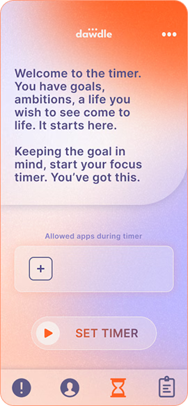 Timer, before
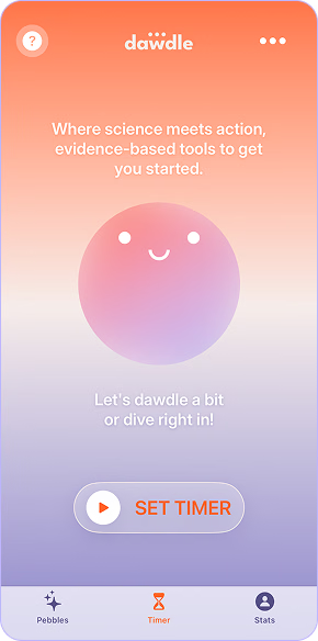 Timer, with Pebbles
03 AI coach
Pebbles finds why you're stuck and coaches you to start
People procrastinate for different reasons, so each reason needs its own strategy.
Pebbles asks why you feel stuck, such as fear of failure or overwhelm. It walks you through a strategy for that reason, helps you calm the feeling, and encourages you over the first barrier: starting.
I planned the coaching features with the founder and the engineering team, working from beta feedback.
04 Timer flow
A linear timer gets you past the hardest part: starting
How might we design a timer flow that removes mental and emotional friction and keeps momentum?
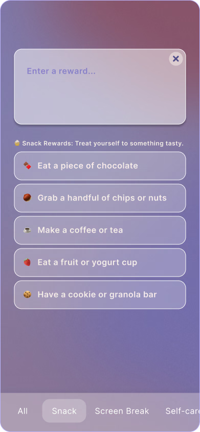 Reward
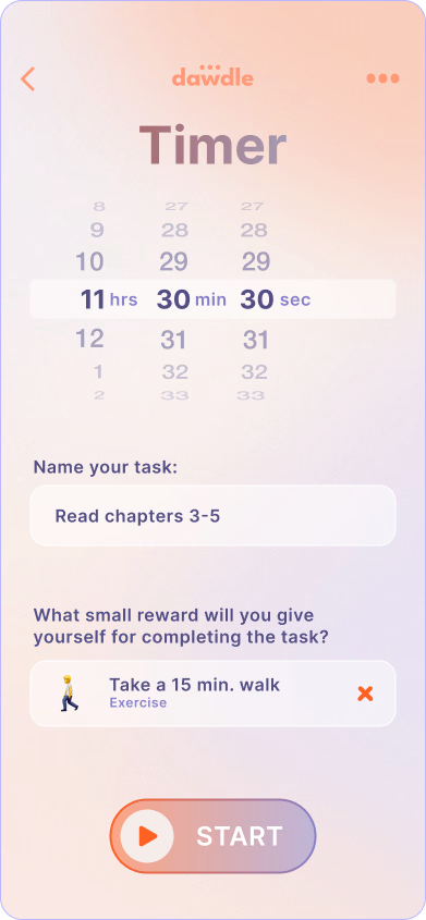 Collection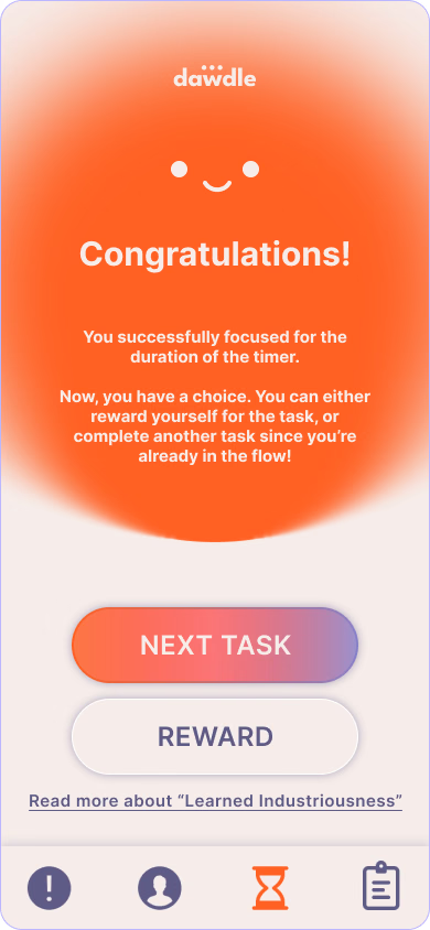
05 Impact
Dawdle launched with 200+ users and a five star rating
Dawdle shipped to the App Store, and KCBS radio featured it.
- 40+
- Components in the Figma design system I built
- 25%
- Reduction in design-to-dev iteration cycles
06 What I learned
Pebbles shaped how Dawdle felt more than the palette did
Designing for emotion goes beyond aesthetics, like a palette that is both soothing and energizing, or flowing shapes and gradients. I studied how Duolingo and Finch use their mascots to encourage people, and saw how much of Dawdle's emotional experience depended on Pebbles.
Designing Pebbles also introduced me to system design. The character started as an AI chatbot, and I soon saw it could also onboard users and cheer them on in the background across many screens.