Redesigning GOLD
(UCSB's Course Registration Website)


1. Overview
This project was created under SB Creative Lab's Beginner Project Teams program of Fall Quarter (Oct.-Dec. 2023), and was my first product design project. While I had intuition from making marketing graphics and posters for clubs and visual arts backgroun from digital painting, this was my first time completing a design process centered on UX research and iterative feedback.
Work Delegation
- I worked with two other designers under a project manager.
- We contributed to forming the survey, interviewing, and affinity map together to summarize the user persona and pain points.
- We each tackled one page to do sketches, lofi, and hifi. We all gave each other feedback in between each of those steps.

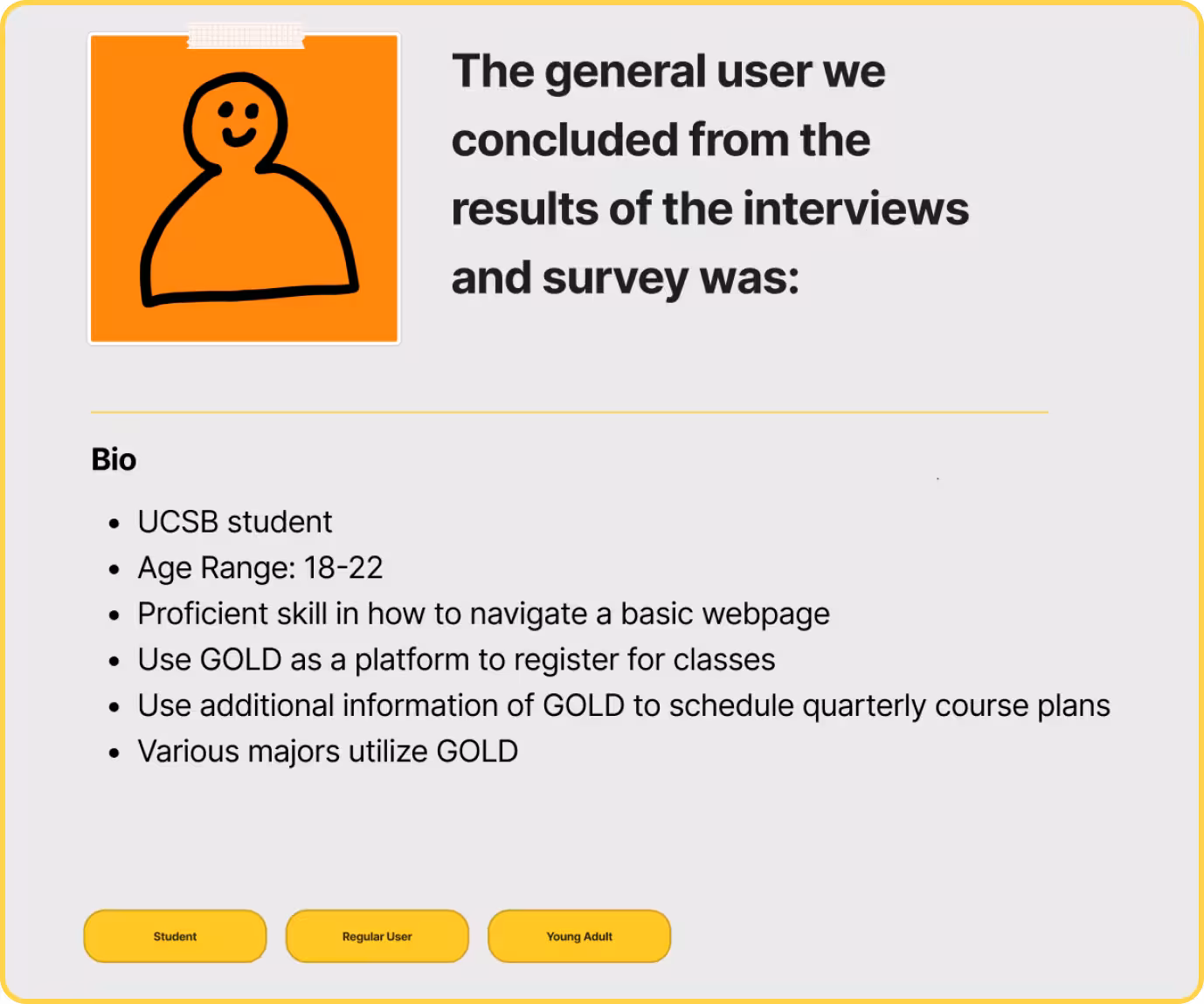
2. User Research
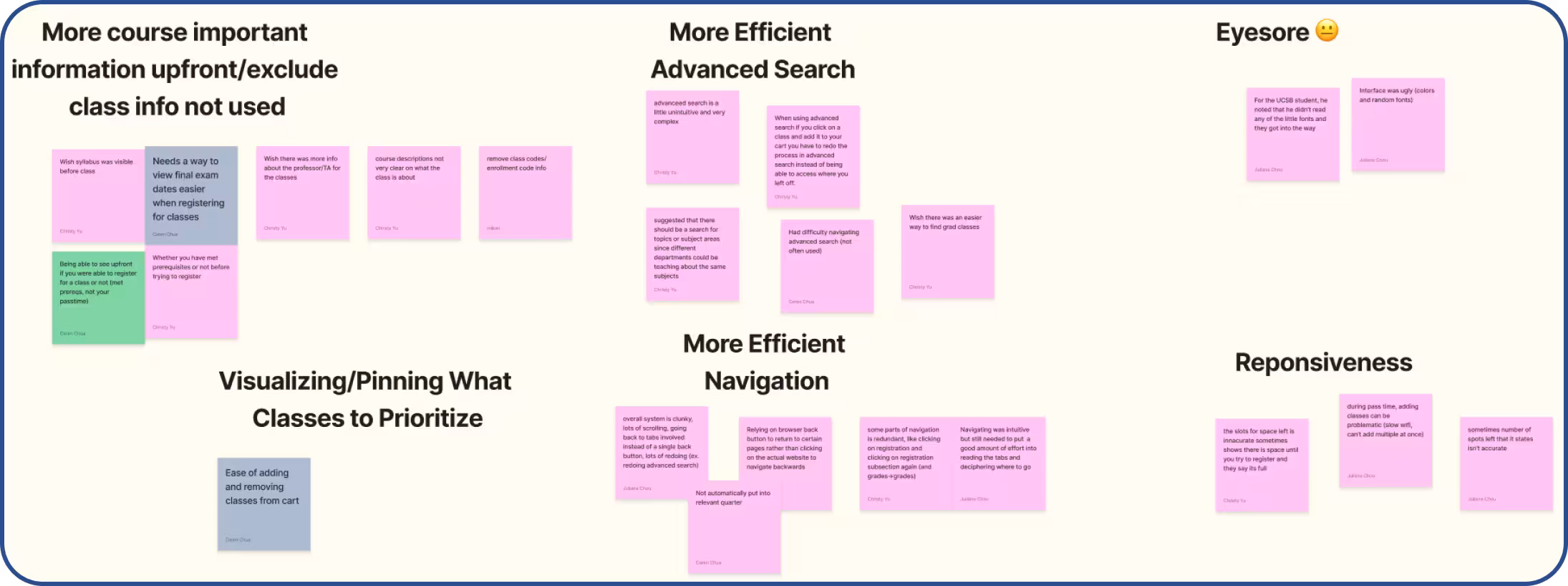
The group looked at the responses from the survey and interview notes, and wrote key points down. We then affinity mapped by grouping main concerns!
Survey
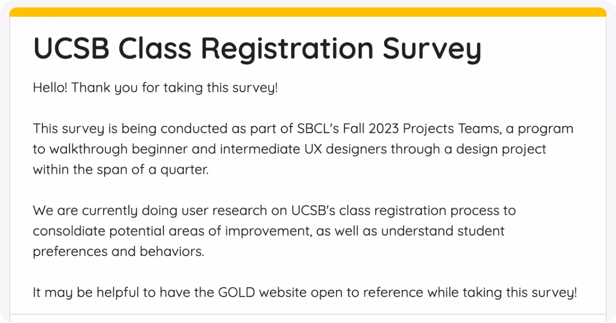
Goals
- To gauge and validate the major user pain points of using GOLD
- To understand the user persona (WHO is using the website)
- Initial assessment and thoughts of GOLD
- Collect quantitative data
Outcome
After brainstorming as a team, we came up with questions that inquired about class registration, ideal features, pain points, and ease of use for GOLD.
We found that designing a question to specifically pinpoint what we wanted was easier said than done. Walking through different variations of the questions after brainstorming helped tremendously.
Interviews
Goals
- To record user behavior on the GOLD website; how do users navigate the website
- To gain more context and description of user pain points
- Collect qualitative data
Outcome
We brainstormed questions asking how users like to use GOLD, opinions on specific interfaces and features, and what they valued most about it. User behavioral testing involved asking them to perform a task in GOLD, such as searching for registration time, checking grades, and filtering for classes, etc.
User behavior data was super useful to pinpoint what was subconsciously an efficient design feature or not on GOLD. Additionally, interviews allows for more clarification of answers to questions that surveys don't allow.
User Pain Points
-
Prioritizing Important Class Information
- Important class info to students including pre-reqs, description, and syllabus are not very accessible to user.
-
Difficult to Navigate Advanced Search
- The advanced search layout was unintuitive and complex.
- Unused filters cluttered the page.
- Having to re-enter filters when starting a new search was also frustrating.
-
Inefficient Site Navigation
- Clunky, required lots of clicking
- To return to a page, users need to click through the tabs again rather than a single back button.
- Fonts too small
-
Lack of Visual Appeal + Low Responsiveness
- Number of available spaces for a course can be inaccurate.
- Inconsistent fonts and sizes
- Page layout incohesive

3. Ideation (LoFis)
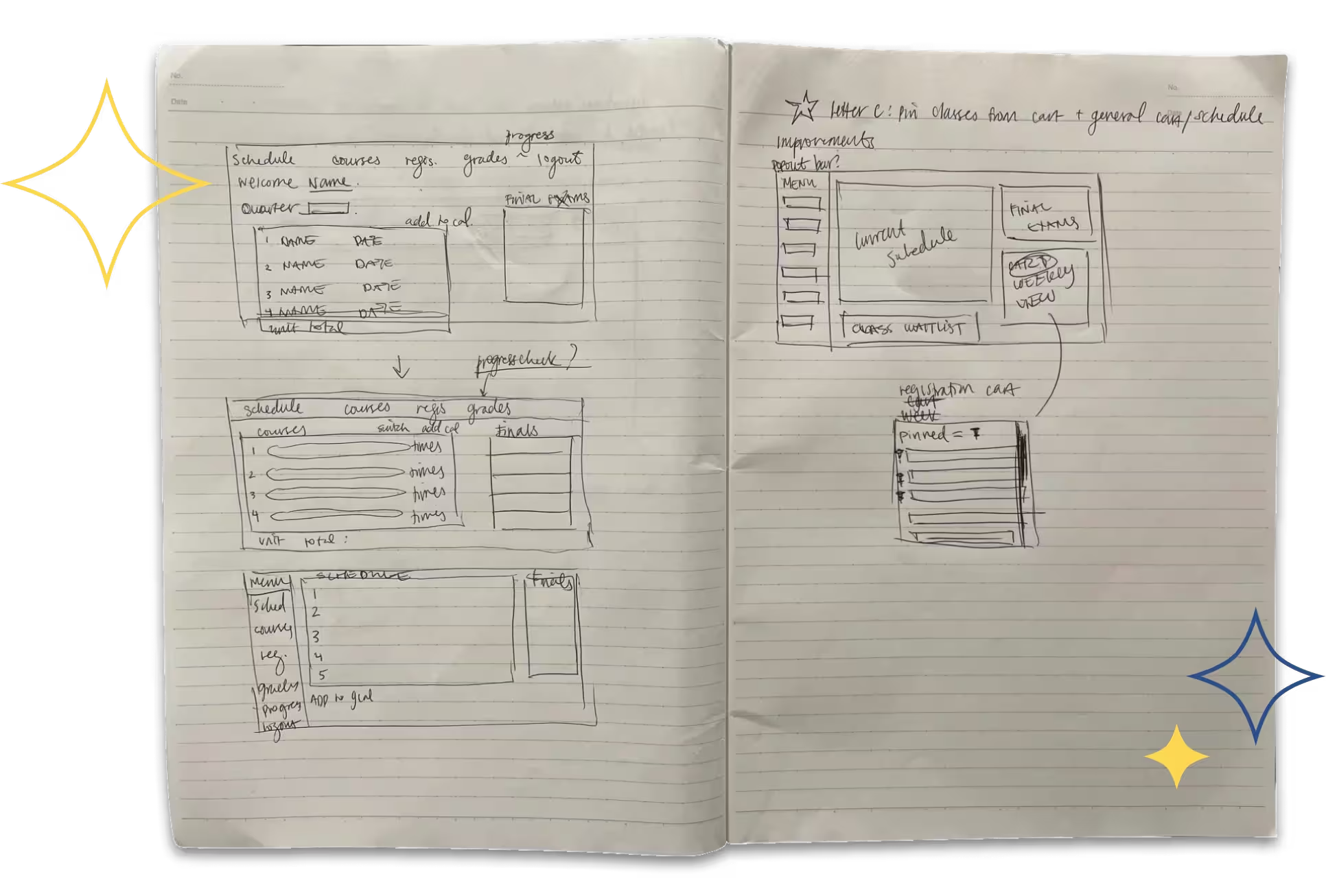
Home Page
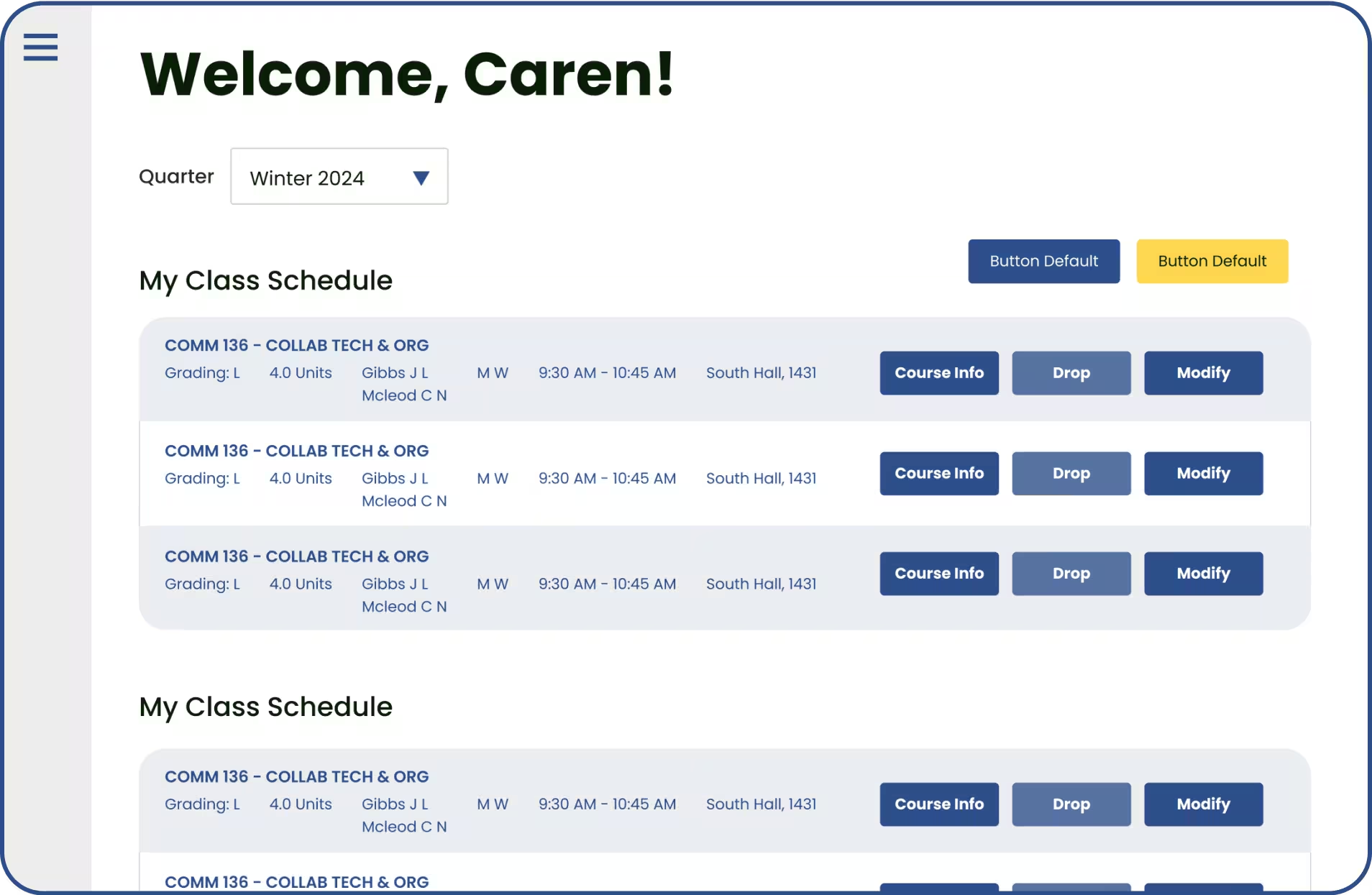
We wanted to create a uniform dashboard that minimized scrolling to see all information, so we designed a one-page layout to get all info needed for current classes.
Original Page

LoFi Mockup
LoFi Mockup
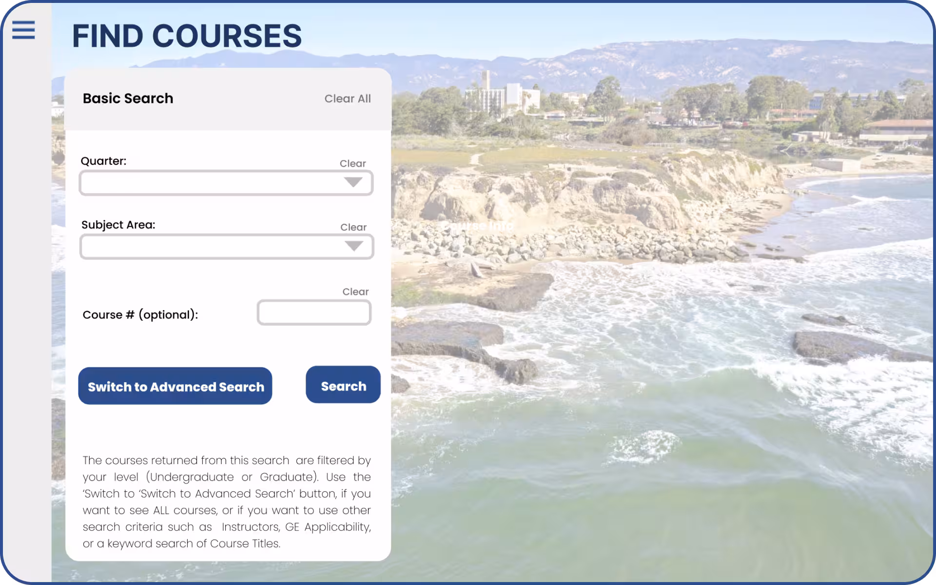
Advanced Search Page
The filters of the old page were messy and cluttered, so we prioritized with the most popular filters used to simplify the page, which allows users to scan the screen quicker.
Original Page
LoFi Mockup
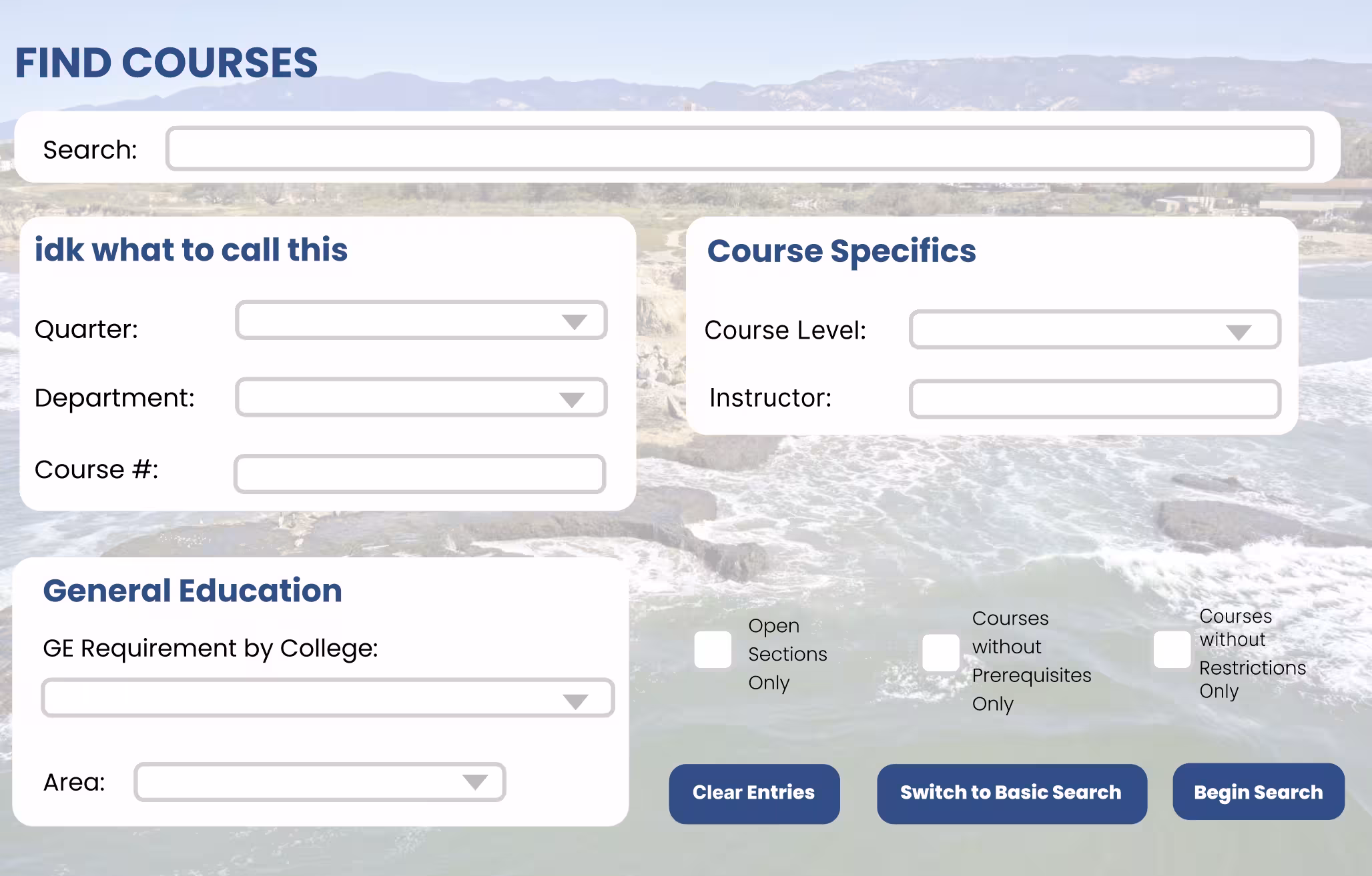
LoFi Mockup
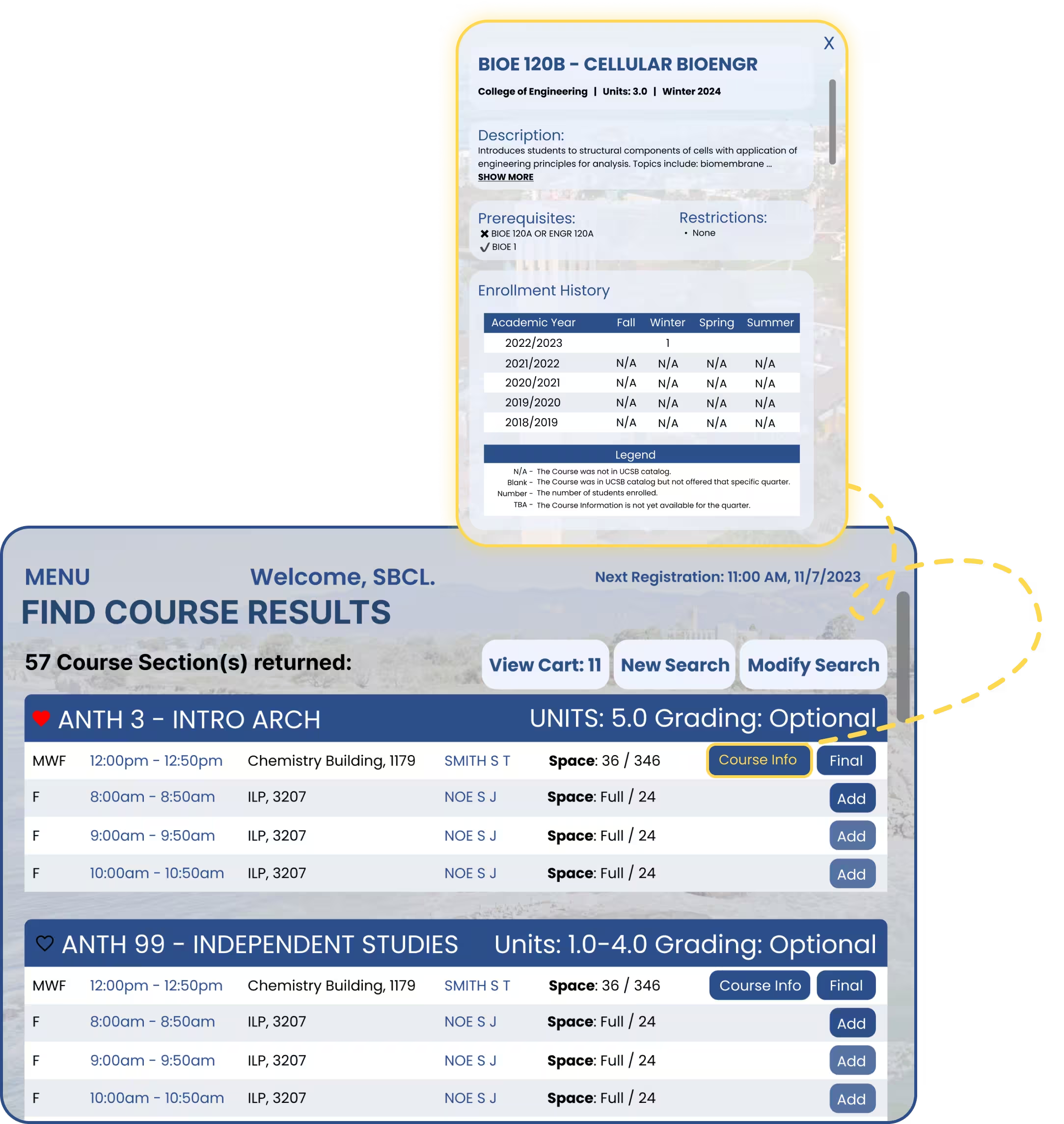
Course Information Pop-up
Currently, Description, Prerequisites, Restrictions, and Enrollment History are scattered to multiple tabs, so we condensed it to one page since each info did not take up a lot of space, and it users can see all info quicker. Also, we removed irrelevant information that users complained about.
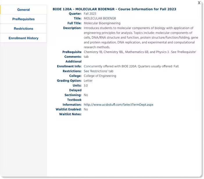
Original Pop-up
LoFi Mockup
LoFi Mockup

4. Iterations (HiFis)
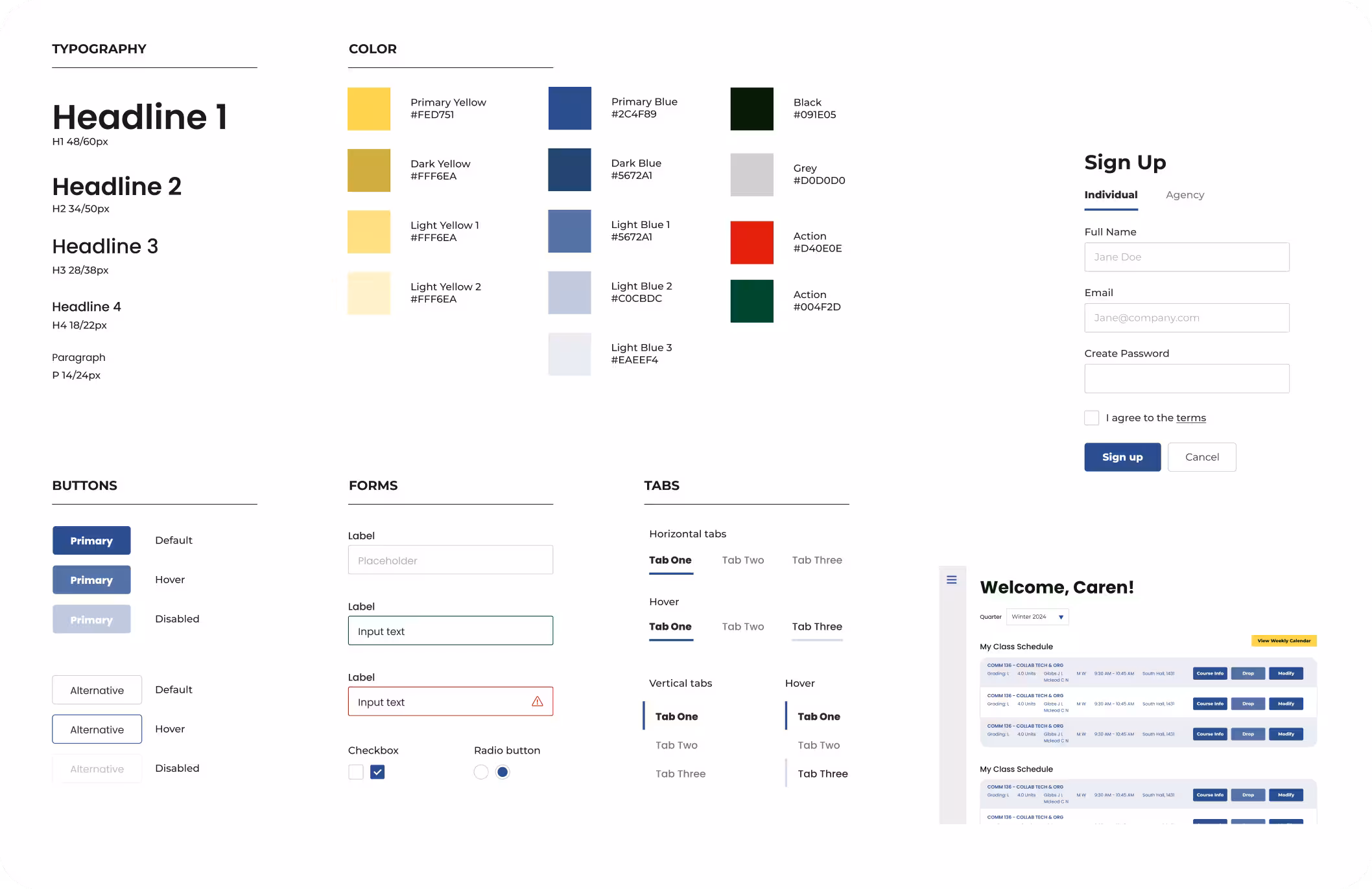
Our Design System -- finalized colors, font hierarchy, and other components
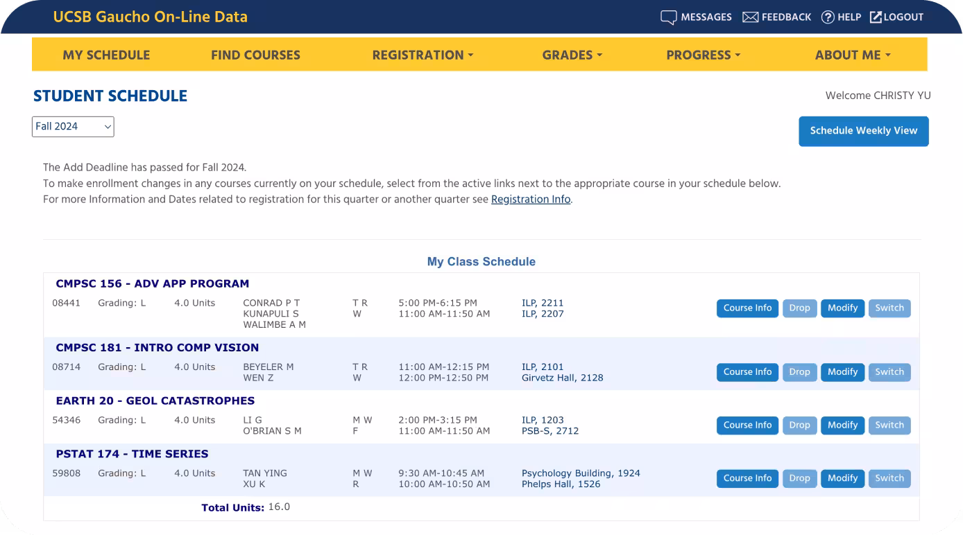
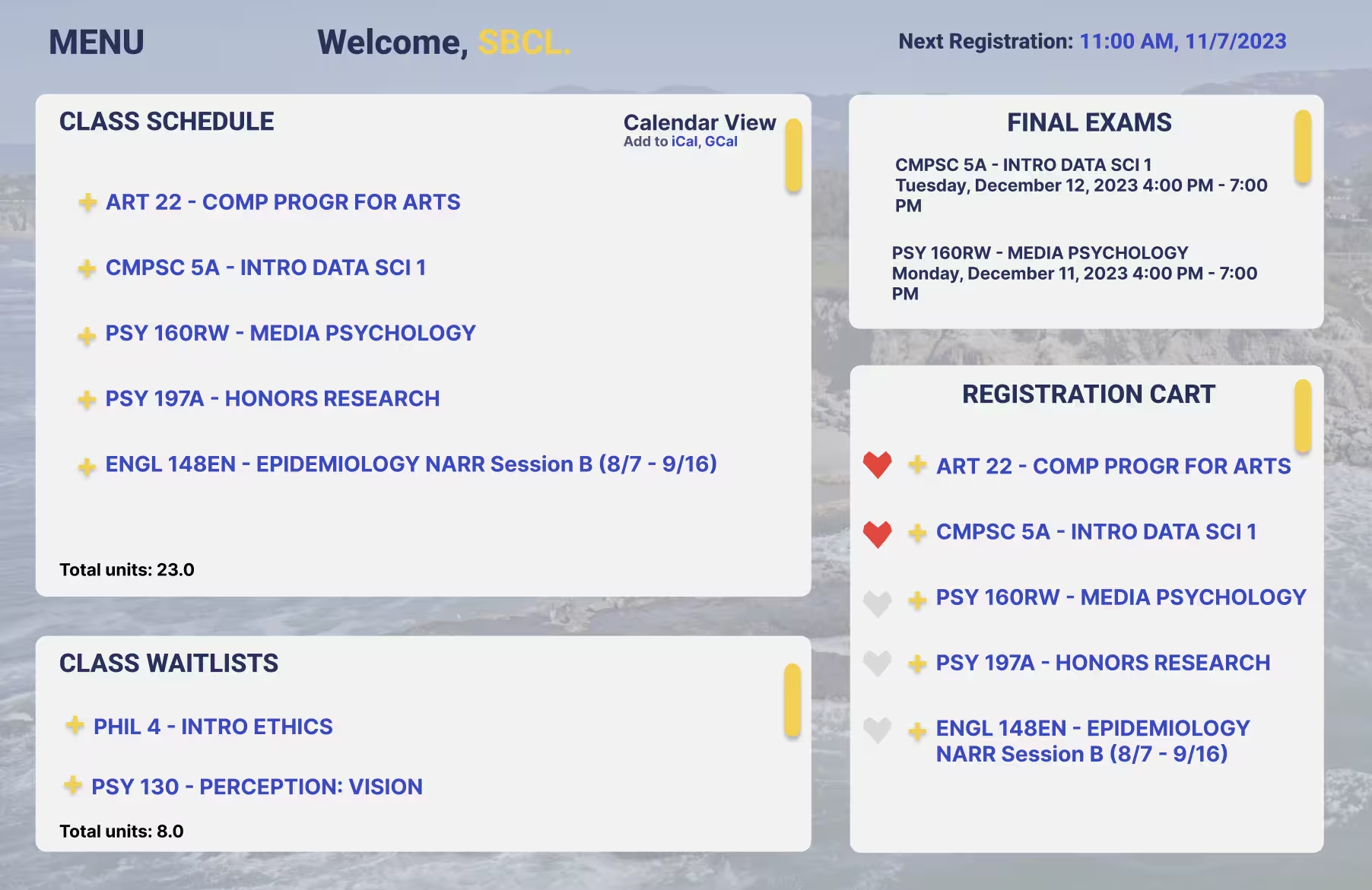
Home Page Dashboard Revisions
- Menu Icon
- Displayed Information for class time, location, details
- Applied style guide for uniformity
LoFi Page

HiFi Mockup
HiFi Mockup
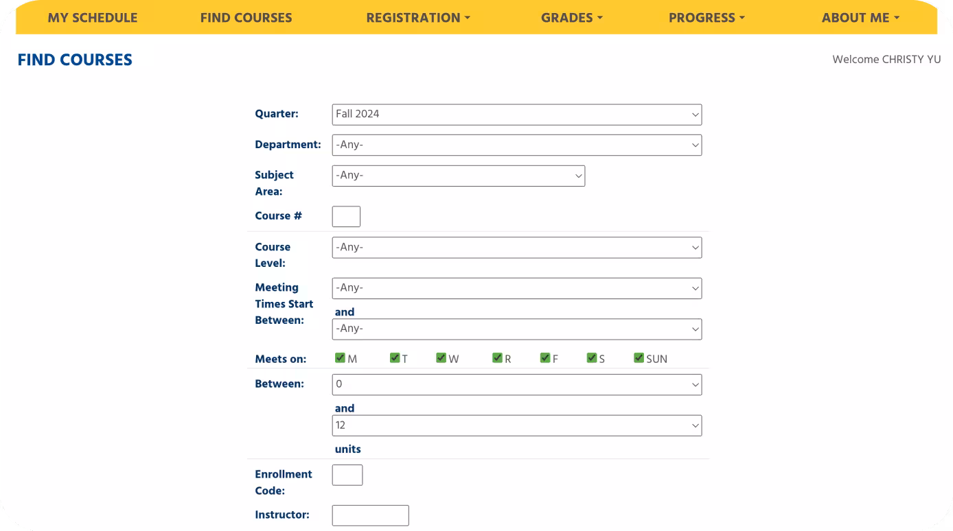
Advanced Search Page Revisions
- Reformatted layout into a more intuitive flow
- Categorized by Basic Search and Advanced Search to not clutter queries with too many details
LoFi Page
HiFi Mockup
HiFi Mockup
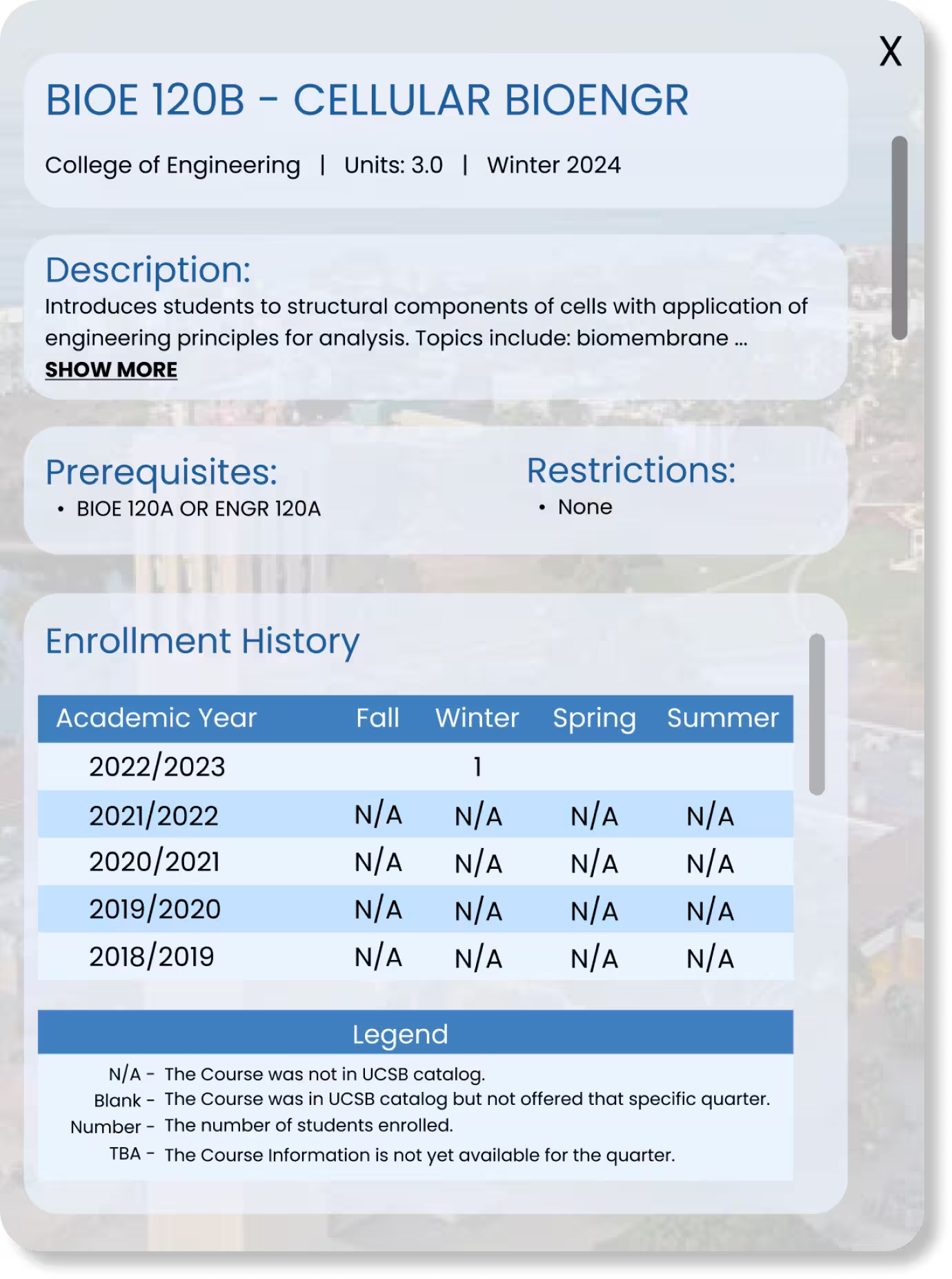
Find Course Results + Info Pop-up Revisions
- Changed bullet points to checks or crosses in Prerequisites
- Applied style guide
- Underlined "show more" link to indicate clickable feature
LoFi Pop-up
HiFi Mockups
HiFi Mockup

5. Takeaways
This was my first user-centered design project, so it was my first time conducting user-testing interviews, and affinity mapping UX research results. I also used Figma for the first time, as I used to use Photoshop and sketching apps to create graphics or other digital art. I learned a lot of basic Figma features as well as introductory prototyping, all of which I've expanded upon in numerous projects since this one.
I learned that iterative revision is key to a solid design, and that user feedback guides a productive and useful design journey! <3